

Unprecedented Times
A little over five years ago, I was in the process of making my fashion design dreams come true. I had designed several repeating patterns for the streetwear brand called Berried Alive I was running with my husband Charlie. And then the pandemic happened. It felt like the dream I had been so positive was about to come true was swept out from under me. People kept using the term “unprecedented times” to describe that feeling where none of us knew what was going to happen or if things would ever go back to normal. I know unprecedented times can and will happen without any warning, and I truly know that there isn’t a “right” time to start a business. Starting a new business is hard and scary no matter what year it is. I’ve learned to not only accept the limitations but make the most of them, and now I can pivot like a champion. I’m not letting the word ‘almost’ feel hopeless this time.

Lavendula: A Color Story
For all you fellow color lovers (chromatophiles?) out there, I want to talk a bit about the color I've chosen to represent the House of Caswell brand on the website and any other branded materials going forward. The official Pantone color is called Lavendula, 15-3620, and I've chosen Snowfall and Black Beauty as accent colors.

Goals
My favorite genre of books is the fashion brand founding story. I’ve listened to every book Audible has to offer in this genre, from high fashion brands like Chanel and McQueen, pop cultural sensations like Dapper Dan and Juicy Couture, streetwear like The Hundreds and Eckō, and sportswear like Vans and Nike. This is by no means an exhaustive list, because Audible has tons of books like these to fill my earbuds with a fashion-centered story and a cautionary tale about growing too quickly or the perils of taking the company public. I have learned something useful from every one of these founding stories, and learned a ton about fashion history over the past 100+ years as well, much of which I plan to reference in House of Caswell collections.
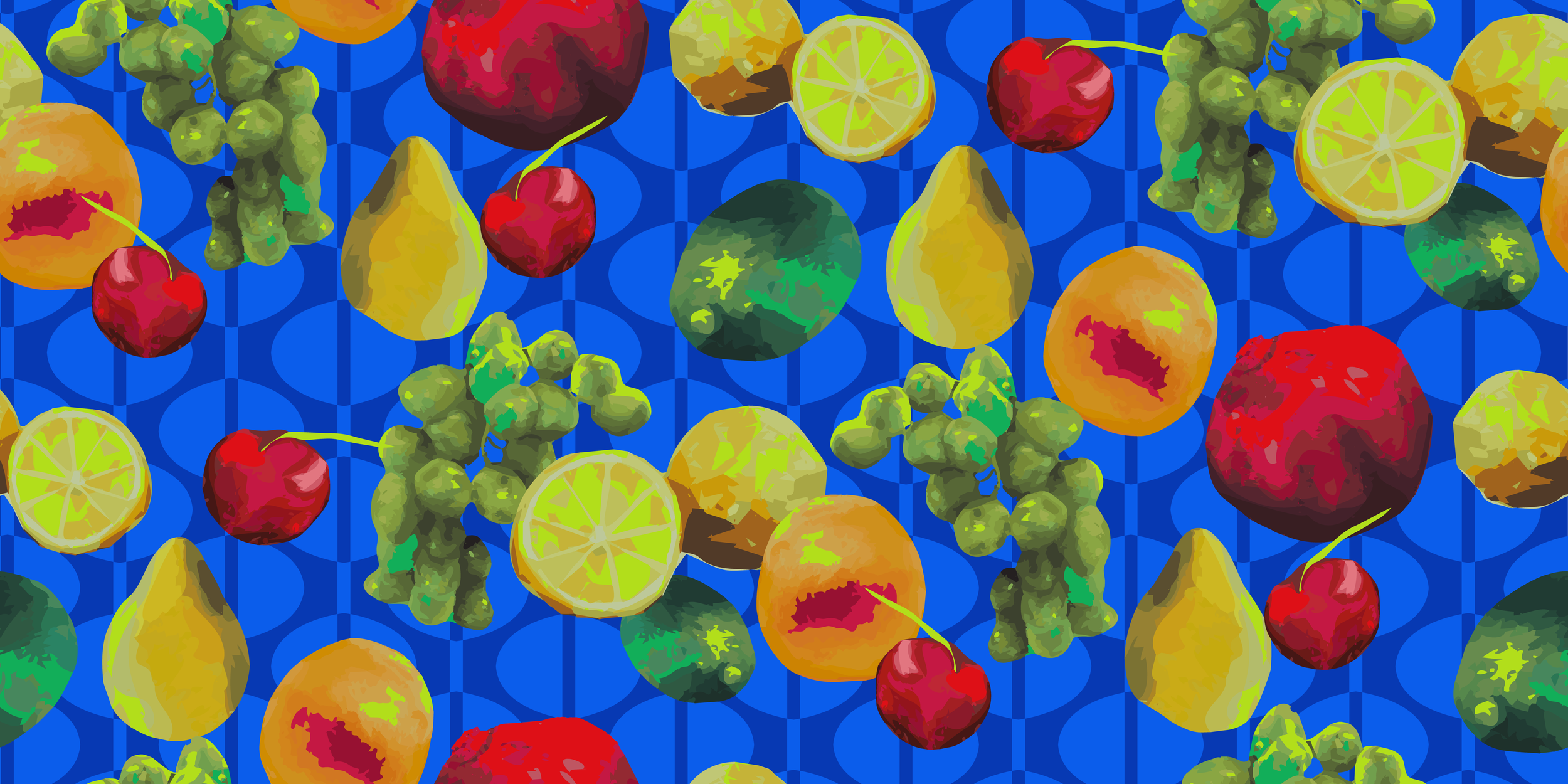
The Layered Fruit Pattern
The Layered Fruit pattern in my Still Life collection is the result of a lot of learning and experimentation, and it also tells the story behind the brand itself. I was taking a lot of courses through Skillshare last year on pattern and surface design for textiles. One of the courses was on how to make a layered pattern, which I chose to do with this pattern, and another course was on creating a pattern collection, which is actually how the seed of the House of Caswell idea was planted.